


As the spring event season kicks into high gear, we’re introducing a sumptuous new collection that is destined to become your “go-to” favorite for upcoming celebrations.
The BBJ Linen Faille Collection brings a fabric long popular in the fashion and home décor industries to the special event industry. With a slightly ribbed texture, a soft, silky hand, and a presence that can be either dressy or casual, this new collection is unique and exciting. The collection has been designed to stand alone or to complement other fabrics in the BBJ Linen catalog. It is available in 25 stunning new hues, all inspired by nature.
Here’s a preview of the fabulous colors and the meaning behind them:
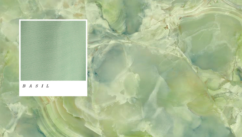
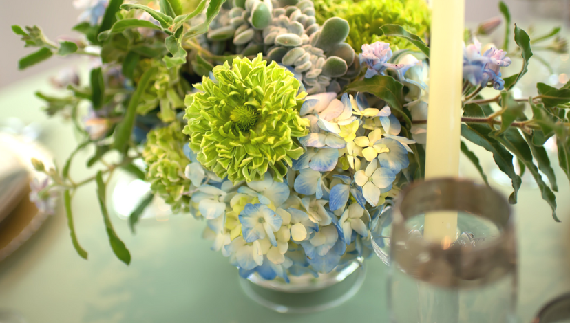
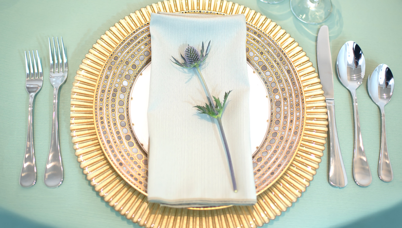
Basil
 Suzanne Palasek | Jackson Durham Floral
Full of character and as fresh as a spring herb garden, basil could well become your new neutral. The color is subtle but rich, and the ribbed texture of the weave gives it depth and shimmer.
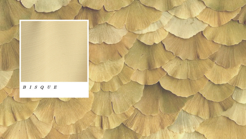
Bisque
 Trä Blume | Minted
The color of wheat, but filled with nuance, this surprisingly adaptable neutral is sure to be a mainstay for table settings. It’s soft but strong and is sure to hold its own as a stand-alone tone, or in combination with many other colors.
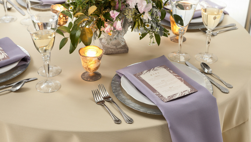
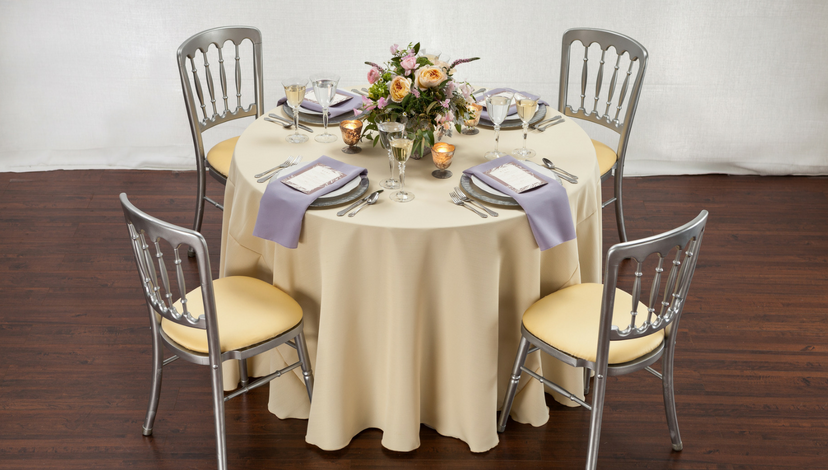
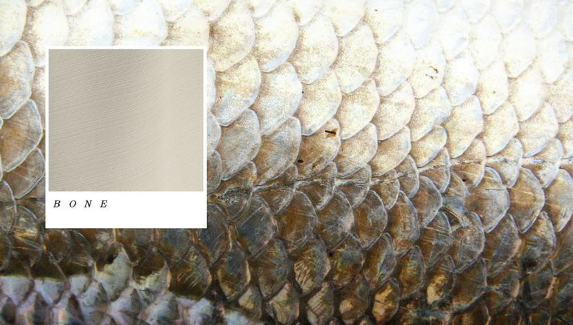
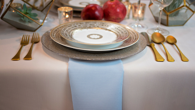
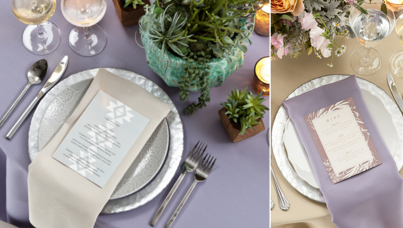
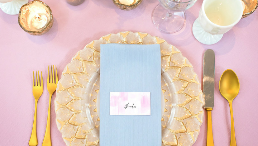
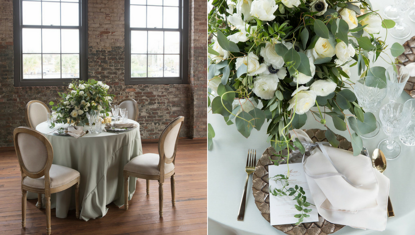
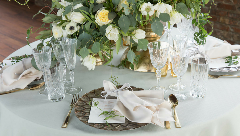
Bone
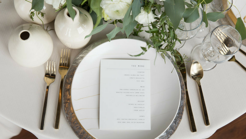 Justin Demutiis Photography | MMD Events | Armature Works
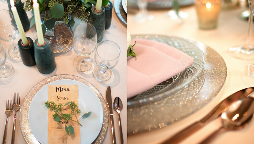
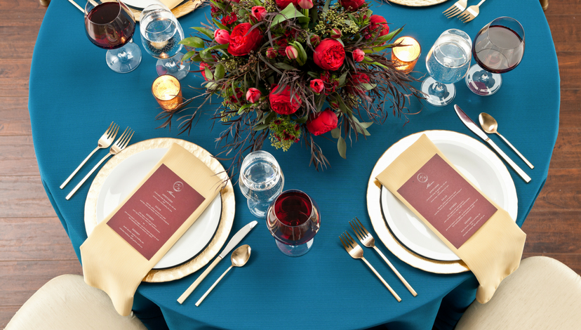
Inspired by the ever-popular antler tabletop décor at rustic events, this updated classic also hints at weathered stone, aging marble and peeling historical architecture. Let it serve as a stepping stone for far-from-ordinary events.
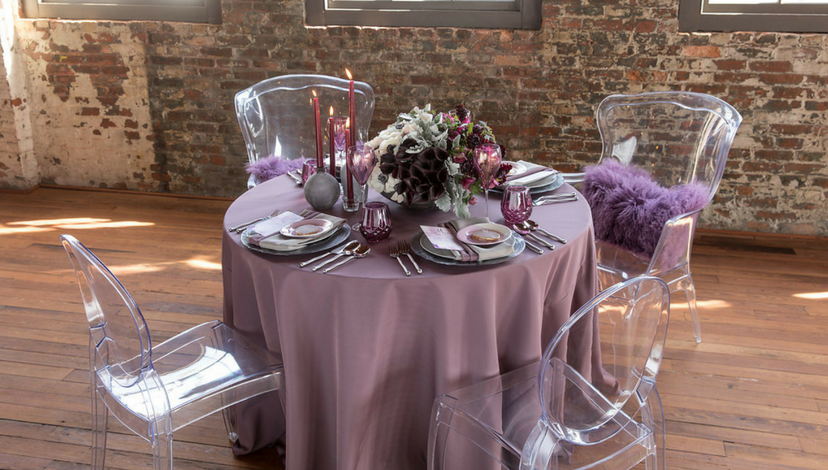
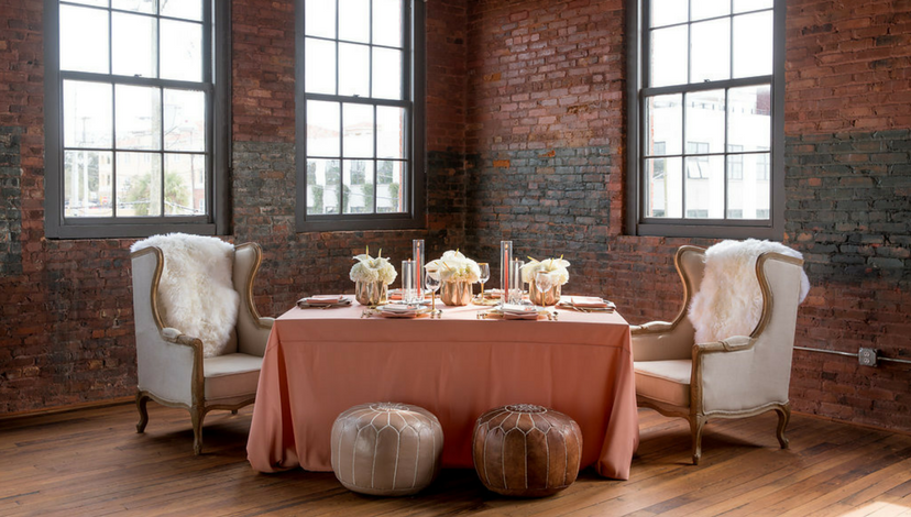
Clay
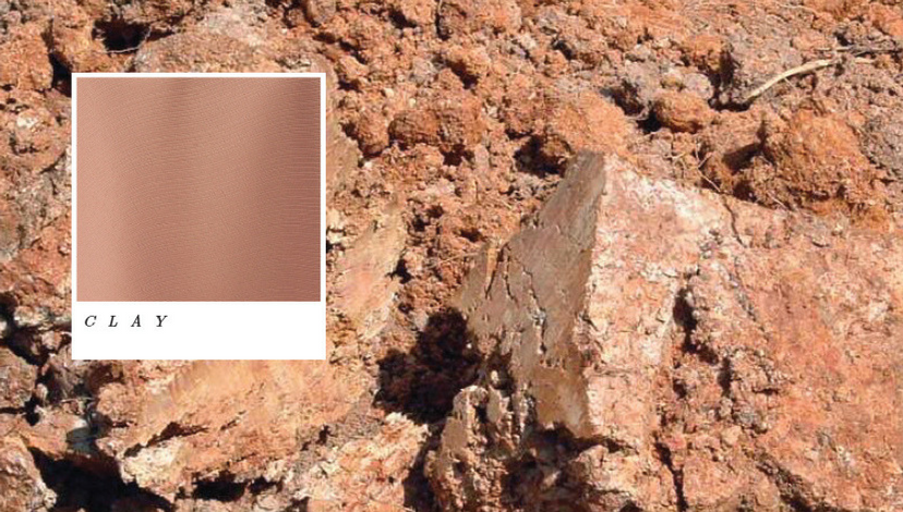
 Left Photo: Justin Demutiis Photography | MMD Events | Armature Works – Right Photo: Suzanne Palasek Photography | Freesia | Minted
Red earth is not a single color, and bare cliffs glow differently at different times of the day. Can’t you just imagine its rosy glow combined with dusky dark tones? Or how about a lighter interpretation paired with softer tones?
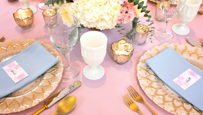
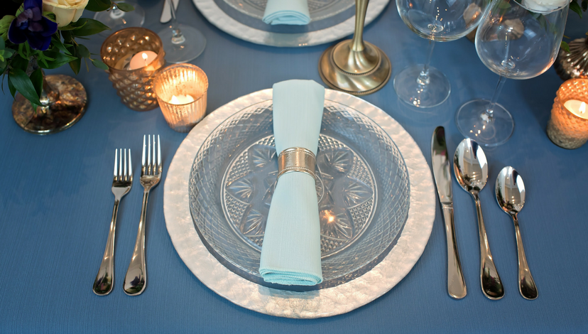
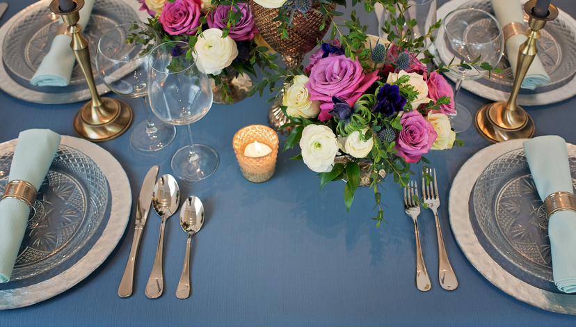
Cloud

 Suzanne Palasek Photography
Not blue, not white, not grey — this is a new expression of non-color. It has enough intensity to stand on its own, but could also be the base for vibrant color. It’s worthy enough for formal settings, but just picture it with yellow. Like rays of sun!
Fig
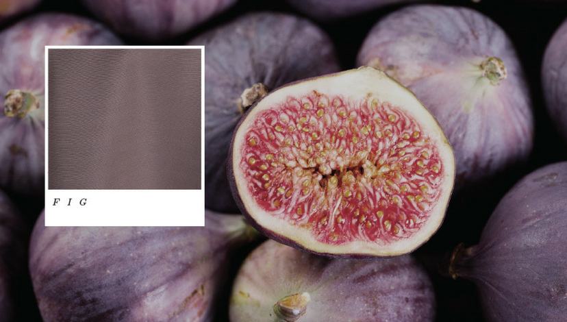
 Justin Demutiis Photography | MMD Events | Armature Works
Much like the fruit itself, this color holds a lot of intrigue. The rich purple notes pair excellently with pinks and reds, but also look lovely with bright spring greens. We love finding new interesting partners to this deep shade!
Flax
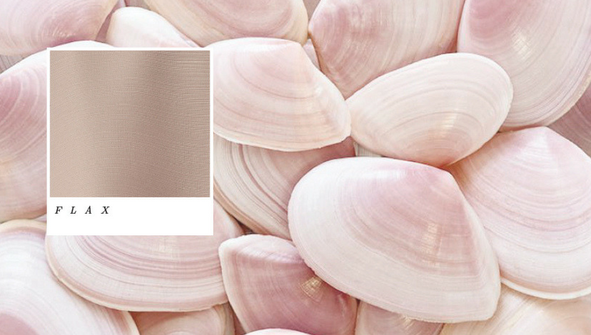
 Suzanne Palasek Photography
While the inspiration for the new faille collection is based on natural elements, the colors are meant to evoke a sense of wonder and unleash new worlds of possibility. This slightly pink neutral is inspired by the seeds used to make flax fabrics.
Heather
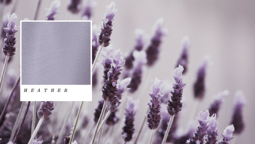
 Minted | Trä Blume
With soft purple blooms in early summer and late fall, our subtle color has many seasons. Straight from the moors, heather is true to its roots — destined to be a lasting favorite!
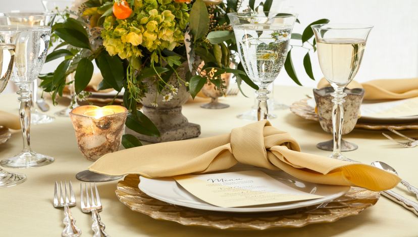
Honey
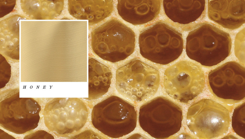
 Suzanne Palasek Photography | Freesia
You won’t have to think long about myriad ways to incorporate this muted gold-tone into your spring and summer settings. As a monochromatic scheme, it will surely be elegant!
Iris
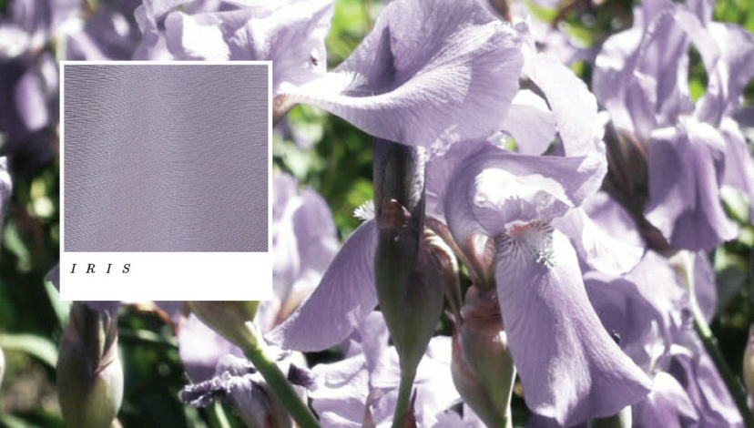
 Trä Blume | Minted
This flower is named after the Greek god of the Rainbow: Iris. While this gorgeous spring bloom comes in many colors, we’re suckers for the stunning purple tones.
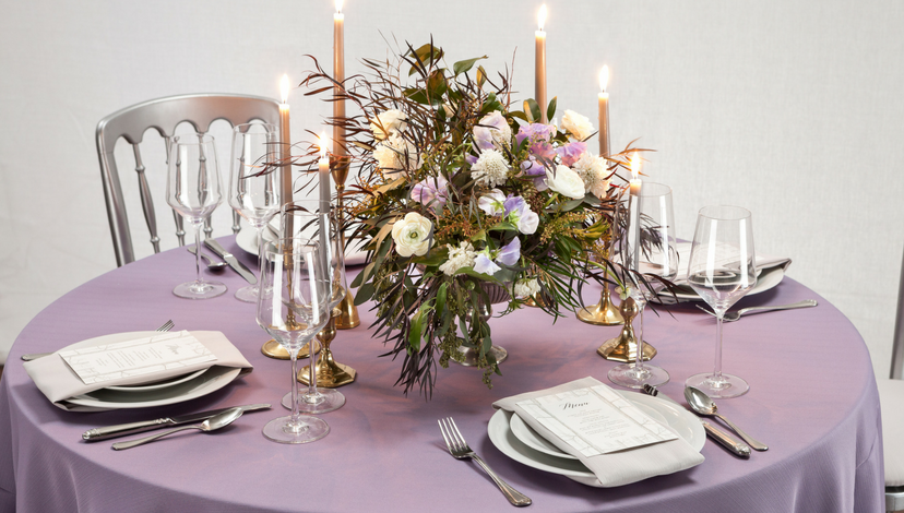
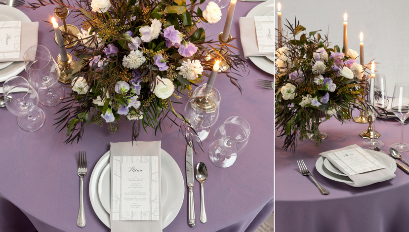
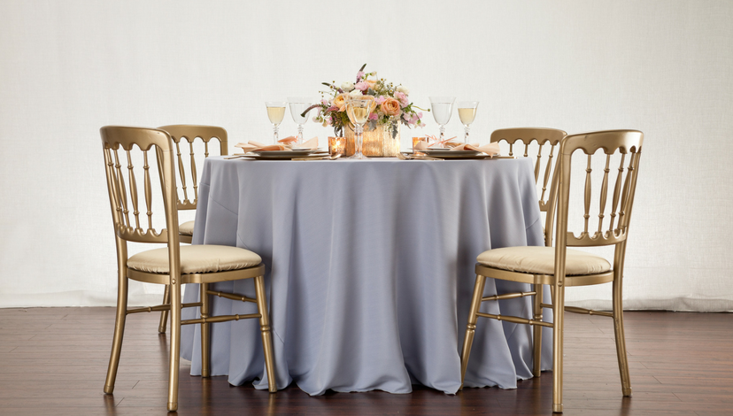
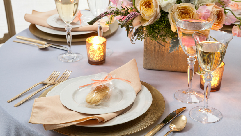
Lake

 Trä Blume | Minted
It’s the icy blue of dense ice with shadows of lavender and grey, and the shimmer of faille makes it even more dramatic. Lake is destined to be a favorite for both formal and casual events.
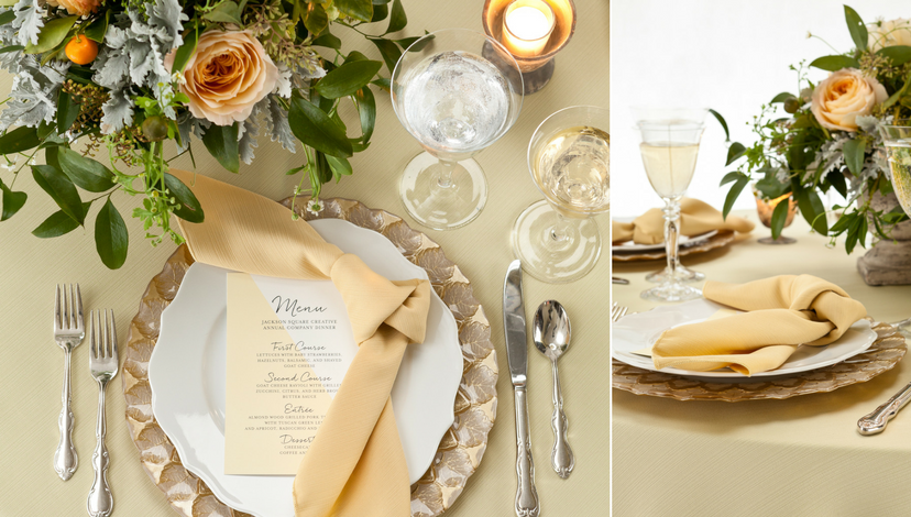
Latte
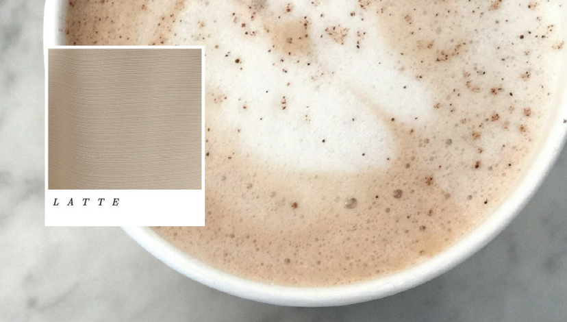
 Suzanne Palasek Photography | Freesia | Minted
Derived from the faded colors of shells on a sandy beach, latte is as satisfying as a whipped-cream-topped coffee. Pair with other creams for a subdued color scheme, or greens and blue for a beach-inspired arrangement.
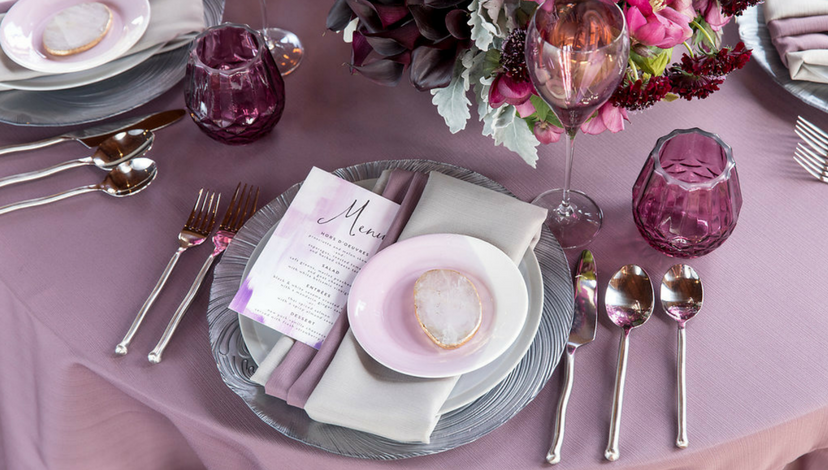
Mineral
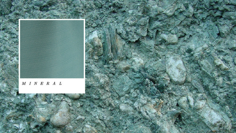
 Suzanne Palasek Photography | Jackson Durham Floral
This color has some of the same character as glowing, layered mica, and the kind of rugged good looks that gives it power and energy. Mineral could easily be formal or fun.
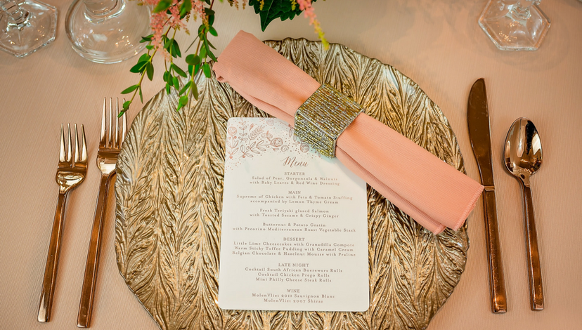
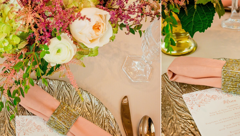
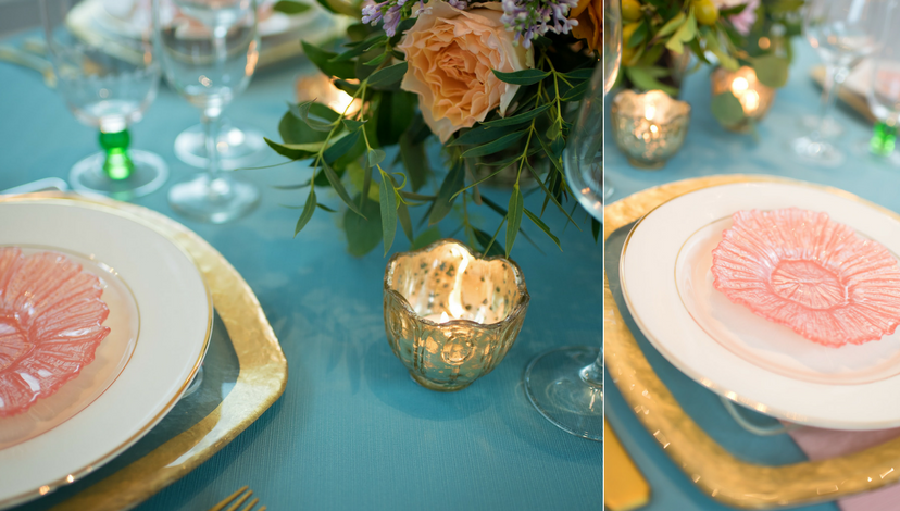
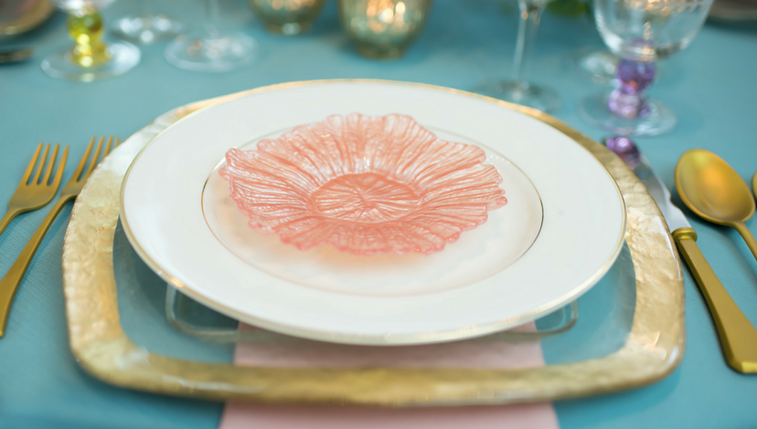
Peach
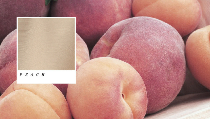
 Suzanne Palasek Photography | Jackson Durham Floral
This is another one of those “barely there” colors that will be immensely fun to work with. Sweet as the fruit, we think this one will lead to delightful surprises for trendy spring events.
Peacock Blue
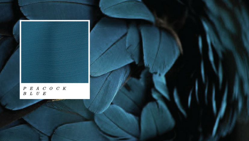
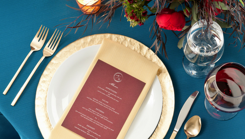
 Trä Blume | Minted
One of the deeper, more intense hues in the faille collection, Peacock Blue is just unusual enough to lead you in a new direction. Inspired by the showy feathers of the peacock, we know this fabric will create dramatic events.
Pear
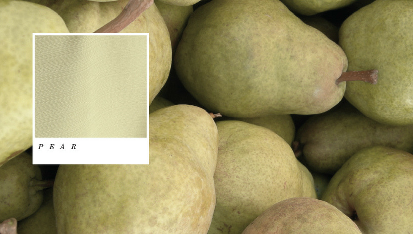
 Trä Blume | Minted
It’s gold – no it’s green, it’s Pear. And it’s supremely delicious — this one’s a keeper for spring events, and on into fall. We can’t wait to see where creative designers take it!
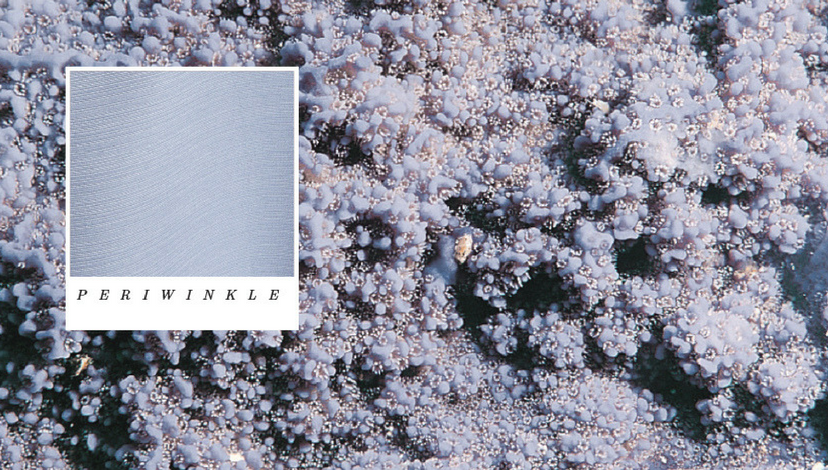
Periwinkle
 Trä Blume | Minted
True to its namesake, this all-time favorite is even more attractive and adaptable in faille. We look forward to seeing a lot of it!
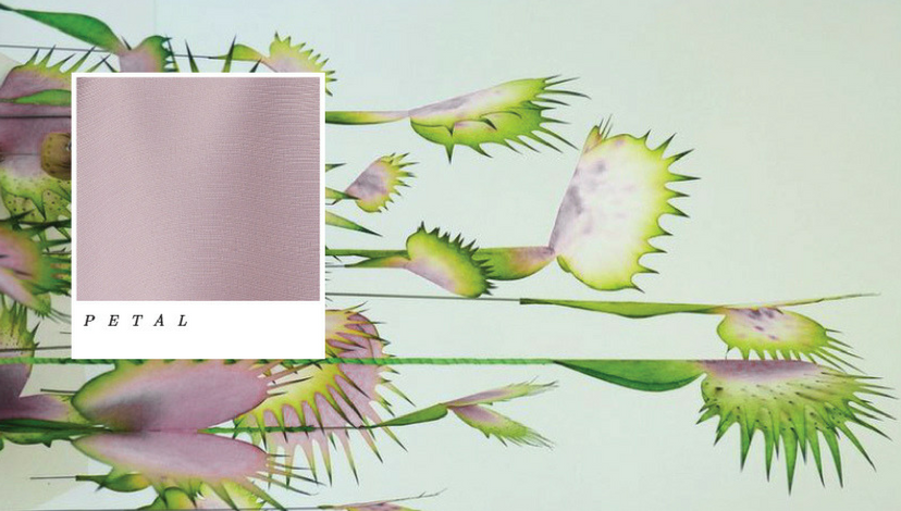
Petal
 Suzanne Palasek Photography | Freesia
Some colors are just naturally dramatic. Petal is one of those and the floral inspiration will give you an idea of why that is true! In fact, it could be a stunning special event color scheme with no other additions.
Pewter
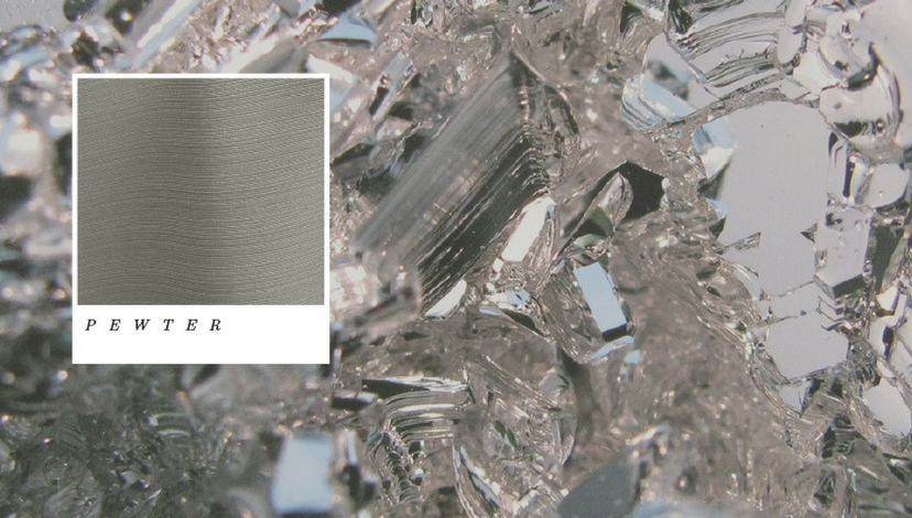
 Suzanne Palasek Photography
Taken from the layered color of dove’s wings, pewter also reminds us of well-used family heirlooms and historic tradition. It has a subtle glow all its own.
Rain

 Fleur Inc | The Lakewood | Nimblewell | Minted
Flower petals, standing water on concrete; blue and grey, and purple all mixed together. This is a child’s paint-pot of delight. Can you imagine it paired with ivory? Or combined with lots of sparkle and shiny silver?
Rosewood
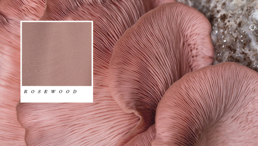
 Justin Demutiis Photography | MMD Events | Armature Works
Hard to define and full of intrigue, Rosewood is not rose, but it certainly isn’t brown. You’ll love its chameleon-like character, and you can pick it again and again to complement a range of other colors.
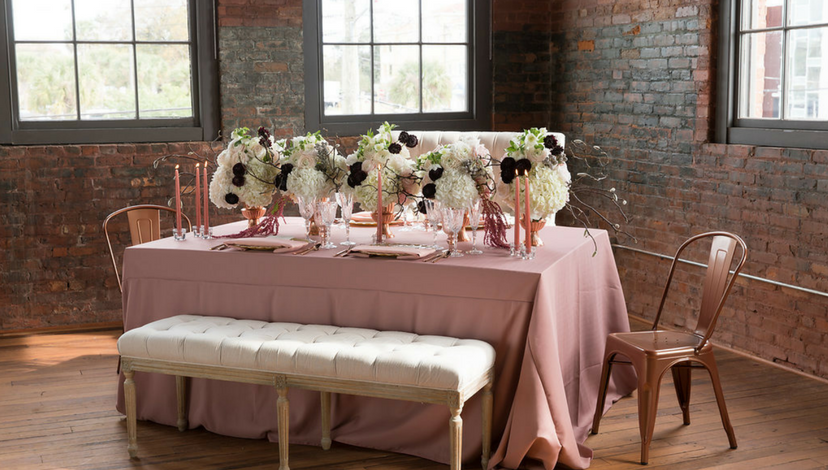
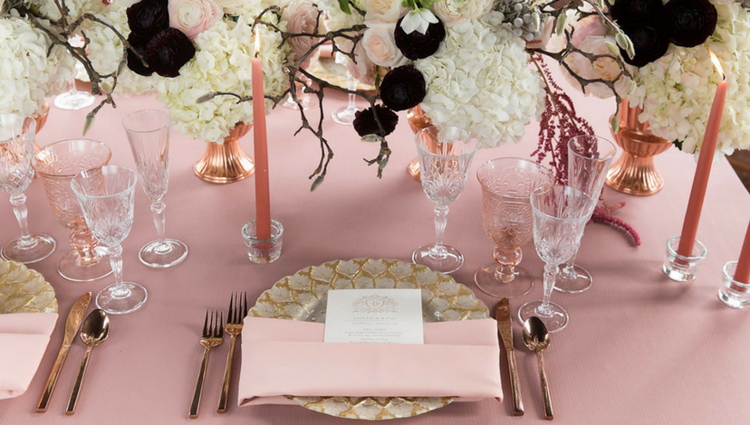
Salmon
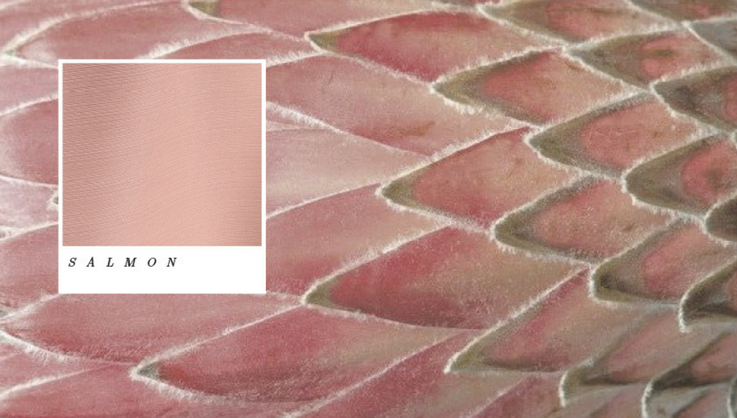
 Justin Demutiis Photography | MMD Events | Armature Works
A full-bodied pink-rose-peach blend, salmon will take on bold character when combined with other colors. Try it with green, or layer it with many shades of its own color family.
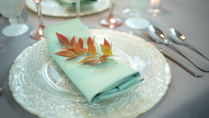
Sea Glass
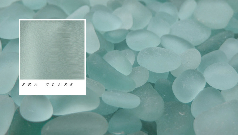
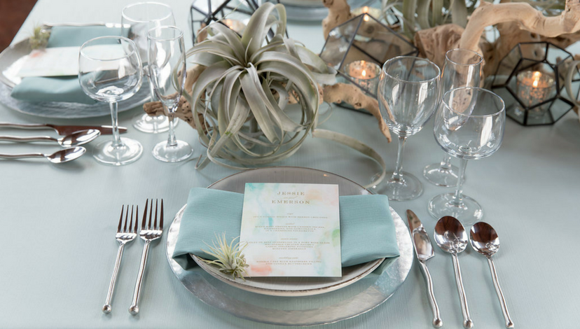
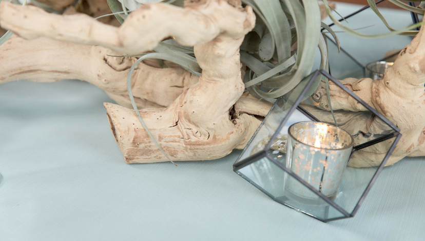 Justin Demutiis Photography | MMD Events | Armature Works
Pale and watery, Sea Glass is almost blue, almost green — and better for the combination. It embraces a universal fascination with the sea and with the objects washed in from the sea. The color is delicate and timeless.
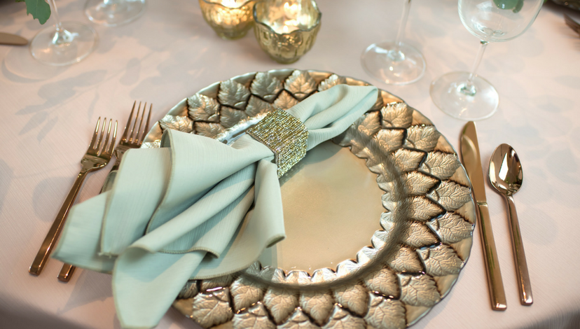
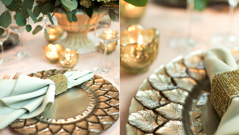
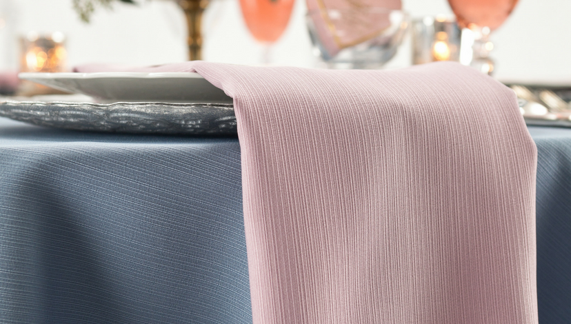
Slate
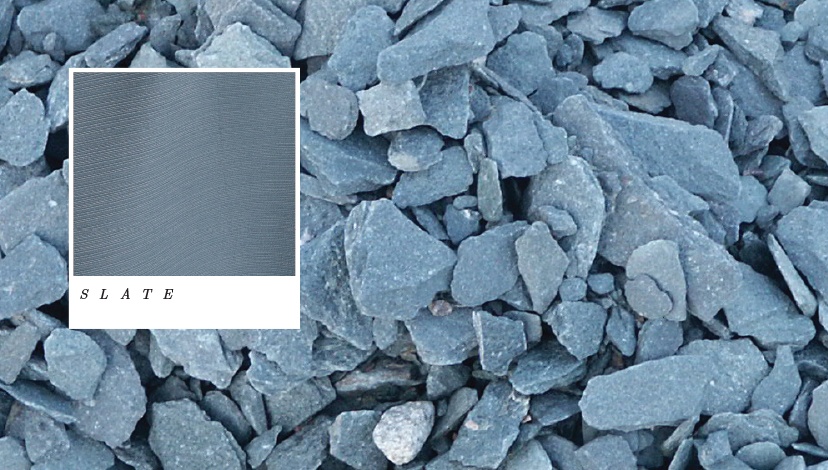
 Suzanne Palasek Photography | Freesia
A glorious tone taken straight from one of the most beautiful shells on earth! An intense, but easy-to-love tone, it may just become the “new black” for next season’s formal events.
Succulent
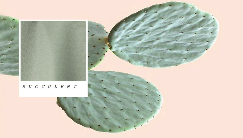
 Justin Demutiis Photography | MMD Events | Armature Works
A grey-green, this interpretation of those hardy plants exhibits a go-with-anything spirit that will create new dimensions for any event scheme. Combine it with bright desert flowers to make it pop!
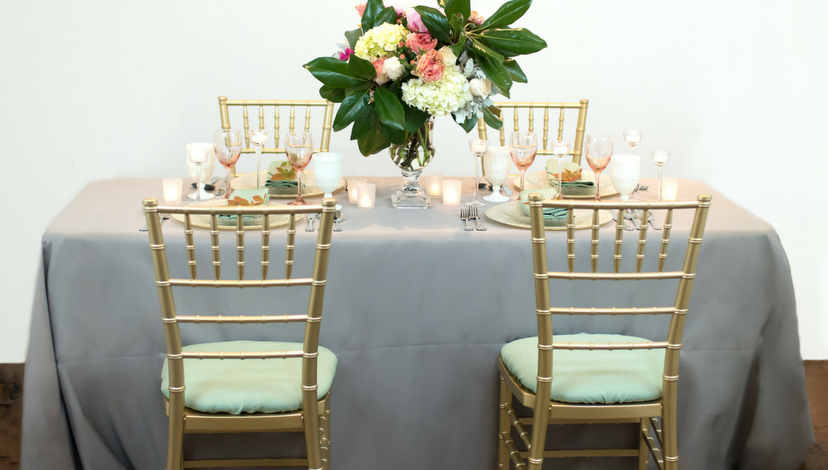
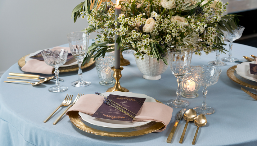
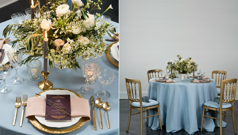
Be Creative
We know you’ll find many ways — and many reasons — to pair one color with another from the new faille collection. But there are myriad other ways to express yourself. This new collection is available in sizes ranging from napkins to King’s drapes. The subtle ribbed texture can be formal or rustic and drapes beautifully. We can’t wait to see what combinations you create!